

The massive demand for web content has opened a considerable number of opportunities for both writers and designers. Many writers have jumped into the field of providing content, flying on the tails of intuitive taste, and relying on their ability to bluff and learn quickly. The basics of HTML code can, with perseverance, be mastered in a weekend, but does basic web formatting do justice to the words that carry our language?
I wait for Payton to reach a stopping point before beginning the interview. When his face finally turns from the light of the screen, he blinks, stretching his eyebrows a few times, and rests his hands in his lap.
I tell him my concern for the convergence of content writing and content design, explaining that web copywriters are often expected to do web design. I ask if his situation is similar; if he is expected to write copy.
“I don’t think I’m expected to write anything. It’s up to my clients to tell me what to say. Depending on the project, I might be okay with writing copy, but it’s not my job, and it should never be expected.”
He speaks with a firmness that most of us have forsaken for the sake of getting paid, the result of which is a lot of poorly designed web sites.
The ability to write is transferable from print to the Internet, but the necessary process between the first draft and publication can now be radically abbreviated. Published works of print uphold a standard of content and design which the Internet does not.
In spite of the increasing percentage of reading done on the Internet, a good portion of it is uncomfortable to read. Ellen Lupton, author of Thinking With Type, says this is largely a result of poor typographical choices. “It’s like walking into a room that has bad lighting,” she said, “Most people walk in and they know it is unpleasant. They know they don't feel good in the room, but they don't know why. An interior designer walks into the room and says, 'It's the lighting.' Typefaces work the same way."
As a result, readers usually skim web content, remaining on a page only as long as it takes to pick out a snatch of something useful before clicking “back” or following a link.
A study by Jakob Neilson revealed that 79% of online readers scan any new page they come across before they will read it, and, according to The Sticky Site, 50% of visitors leave before 8 seconds. Even if readers are not consciously aware of bad design, it is often what determines how long they are willing to stay on a page.
Writers should be aware of the importance of design because, ultimately, it doesn’t matter what we write if no one wants to read it.
Payton points out that the lack of consideration for design is not a result of the Internet, but accessibility. “The problem exists in print too. It began with word processing, and access to printing. To be able to pump out anything in full-blown text is dangerous. It leads to the assumption that because you have a computer, you know how to lay out a page. It has nothing to do with knowing how to use a word processor. They’re entirely different skills.”
Payton supports writers taking an interest in design, and not just so we might better serve the role of do-it-all content providers. He explains that the integrity of both writing and design is still upheld in higher budget projects, where they are separate, but reliant upon each other.
“Design,” he says, “when done right is taken really seriously. It costs a lot of money and requires a lot of planning. There would be a whole team of designers, writers, and web site builders. If we were on a team it would help if I was familiar with how copy writing works, so I could make it easier for you. It helps me if you have an understanding of design.”
A first step for someone who wants to learn about design is to start reading books on typography. According to Payton, “that’s basically what web design is.” There are all kinds of books on typography, from manuals and guidebooks to style, history, and theory.
Typography is a huge field of study. Wikipedia defines it as “the art and technique of arranging type… which involves the selection of typefaces, point size, line length, leading (line spacing), tracking (adjusting the spaces between groups of letters), and kerning (adjusting the space between pairs of letters).
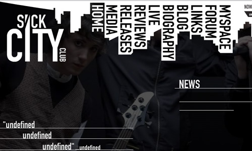
Here are some examples of typography on the web


There are similar fonts used by computers unequipped with the chosen font, but many designers feel they are poor substitutes. Arial is the Windows equivalent of Helvetica, but a typographer will tell you the difference is revolting.
When I ask Payton about the limitations of type on the web, it’s evident I’ve touched on a great irritation of web designers which goes beyond restricted font choices. “You have to test things in different fonts and different browsers to make sure it will look okay for most people. All the browsers render things differently. Safari runs off Apple, Firefox off Mozilla… they all interpret html in slightly different ways.” He briefly rants about Internet Explorer which “has tons of different versions” and “has never followed the standards.”
A subtle excitement quickly comes over him, though. “The group that cares about web typography is small, but it’s getting larger.” He tells me it’s getting easier to do web design, and I ask why. I can see him debating opening a can of technical worms before he suffices to say, “they're building the web into this wonderful thing.“
One change he may be referring to is Google’s decision to host web fonts. As of May 19th 2010, web designers can link to a custom font stored on Google’s servers. Jeffery Way, from web tutorial site Nettuts, believes the font catalog is sure to continue expanding over the coming years.
Google is not the first to make web fonts available, but it is the first highly public figure to do so. Monotype Imaging, a company that owns one of the largest collections of typefaces in the world, made 2,000 of its fonts available to web designers a few weeks previous to Google. FontShop has had several hundred of its fonts online since February.
Web designers have wanted this for years, and, according to Deboarah Netburn, “it cannot be overstated how big of a deal it is.“
"It's like the 'Wizard of Oz' moment when they go from black and white to color," said typeface designer Tal Leming, "It's going to be huge. It's going to be absolutely huge."
Most designers are excited about the opportunities these new font options will afford, but not all of them are convinced that it will lead to beautiful web design. "It's great, but it's also horrible," observed Shu Lai, vice president of the Society of Typographic Aficionados, "Now if people want some random handwriting site, they can have one. It's going to go through growing pains."
Being a web designer will soon require an even deeper understanding of typography and how typefaces work.
I ask Payton if he can offer some general tips on typography and web design. He attests to the paradox true of all fine arts: subjectivity. “There are rules you can follow, but they won’t always work.” He emphasizes a skill which most writers, artists, (and English majors) possess. “You kind of have to just feel it out, and see what looks best. What looks good and reads well.”
Here are some general points to keep in mind:
Design’s primary purpose is to communicate.
The deep intention buried in a design choice is irrelevant to the person viewing the work.
Reading demands easy points of exit and entry.
Don’t use more than three to four fonts on a page.
Don’t change font in mid sentence unless you have a very good reason.
Beware of arbitrarily altering the shapes of letters, and the spacing between letters and words.
Don’t underestimate the value of white space.
Emphasis comes at a cost.
Overstating the obvious can be effective, but not all the time.
Much of typography comes down to contrast and form.
Find out where, when, and for what purpose a typeface was made.
(Sometimes a typeface can have the right “look” but evoke the wrong connotations.)
Letters are not pictures of things, but things.
Words are not things, but pictures of things.
When asked if he would recommend taking classes in web design, Payton admits that they are helpful, but you can mostly learn online for free.
“The community of web design is really giving. People are open and sharing of their work, so everyone can benefit. Well…” he adds with a smirk, “plus, you don’t have a choice.”
Although anyone can do web design, it takes great skill to do it well. Now is a fascinating time to enter the field as a designer, and a crucial time to understand it as a writer. The field is changing, but that is, in part, why it’s so exciting.
“Design wouldn’t survive if we all wanted the same thing, because everyone would know how to do it.” Payton’s eyes relax, and he seems to see something I cannot, “Sometimes it blows my mind thinking about the way things could be done. It’s willingness for change that drives this whole industry.”
—Sarah Preslar
online typography tutorials:
recommended books:
basic type terms:
type anatomy:
free fonts:
No comments:
Post a Comment